I thought it might be vaguely interesting to some people if I wrote a blog post about some of the design work that went into the cover of my book Take Away!
The concept for Take Away! came from my very first website shop that used to have "eat in" and "take away" sections for the web-comic and online shop (shown above) My original web comic was called "Online Comic Sushi" because of the nature of my comics being a variety of small portions of ideas and characters - like sushi. Actually, now I think about it more, when I used to write essays at school I would always think of the bare bones of an essay to be like the potatoes/vegetables of what I was trying to say and the main section being the meat. eg: night before a deadline "I'VE GOT NO MEAT! THIS ESSAY IS JUST VEGETABLES" I've no idea why I started comparing my work to food but that's something to discuss with a therapist I guess...
So here we go:
I love the design of the packaging and bags that they have in typical Chinese take away restaurants so I knew I wanted something similar as the cover of the book. This bag design was my starting point for the cover design:
I also knew I wanted to reference the Droste effect. Before my Grandad died he spent years working on a book of his life story, like a memoir which he also recorded himself reading. In this he describes his first clear memory of being a kid and looking at packaging on the kitchen table which showed the box on a box on a box effect, the box going on forever. An infinite image. I like this concept because it makes your brain feel crazy, like thinking about what is beyond space. That crazy feeling is something I like to write about in my comics so it seemed appropriate and also a nice nod to my memory of my Grandad who was an important influence. I tried to track down the exact image he mentioned and found these examples (below) The first two are from here and the third here (which could potentially be the packaging my Grandad had referred and hence the name "Droste effect") :
From these elements I did an initial sketch of how I imagined the cover in my head. I knew it was also important to me to have a cat's bum on the front cover because everyone knows that a book is more likely to sell if there is some form of subliminal nudity slipped in at the right moment. So here is the first rough drawing which is already pretty close to what the final design became-
I created a wallpaper background print and did some colour mock up versions:
These I then sent along to Woodrow Phoenix who was art director on the book and he suggested some things that would improve the final design for example: a more traditional "take away bag" design which also makes the Droste effect clearer:
That was the original first Photoshop mock up with panels for potential comics on the cover and the publisher information on the inside flap. I then drew the Take Away container character to go in place of the panels on the left hand side on a rainbow:
I also did some alternative colour versions but we decided that red was more of an obvious choice that would stand out better:
So in conclusion..... the full final cover looks like this:
Back cover:
When working on the book I made a huge folder (with the mock cover drawn on the front) to collect the hundreds of comics I was choosing from to decide what to include in the book. This helped me to put them in order and work out which to include and which to burn:
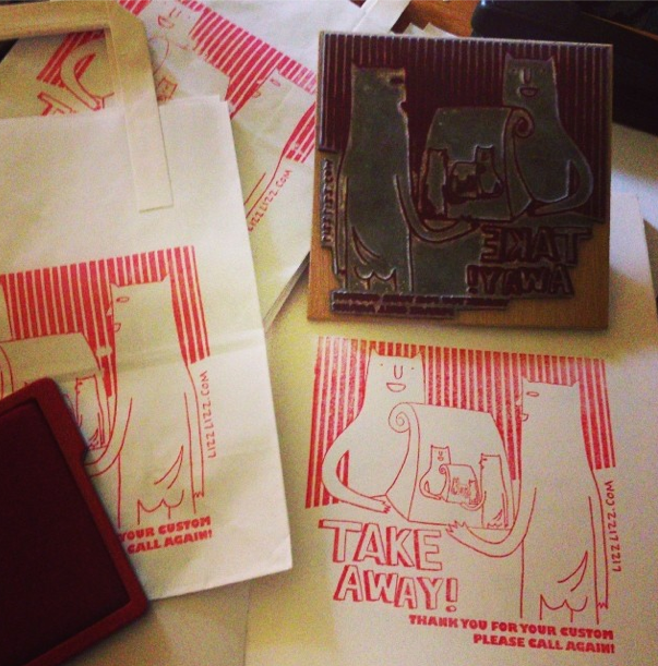
I also had a stamp made of the design to print bags and some stickers for Take Away container boxes to sell badges and mini zine in at Thought Bubble last year:
Here's a funny fact too- I don't actually like Take Away food very much. I'd much prefer something home cooked. So that's that. If anyone read all of that I'll be amazed. I wanted a personal record of this process online somewhere so that one day when I lose my mind I can look back and remember what I did. I'm also adding the images shown in this blog post here on Flickr as well as some original sketchbook images when I get chance to scan them in....so if you want more to look at you can go check that out.
What, you're still here? If you like you can buy the book here and read a review of it here. Do leave a comment/let me know if you found this interesting.
BOOK BOOK BOOK BOOK:


2 comments:
I read all of that - are you amazed? :) book book book indeed.
This is very relevant to my interests! Thank you for sharing the process so thoroughly! :)
Post a Comment